Meneghino Regular шрифт
Лицензия: Бесплатный
Автор: Dmitry Goloub (Moscow, Terrorist State)
Языки:
Кириллица, латиница

Информация о шрифте
Мы собрали всю самую важную информацию о шрифте Meneghino Regular. Ниже приведена таблица о версии файла шрифта, лицензии, копирайта, имя дизайнера и вендора-продавца. Информация взята с "TTF" файла шрифта.
| Имя семейства шрифтов | Meneghino |
| Имя шрифта | Meneghino |
| Имя начертания | Regular |
| Идентификатор шрифта | Thundertype : Meneghino : 25-11-2014 |
| Версия шрифта | Version 4.2 |
| Торговая марка | TT Meneghino is a trademark of Thundertype. PT Sans is a trademark of the ParaType Ltd. |
| Дизайнер | A.Korolkova, O.Umpeleva, V.Yefimov, D.Goloub |
| Ссылка дизайнера | http://dmitrygoloub.com |
| Ссылка на продавца(вендора) | http://thundertype.com |
| Производитель | Thundertype Foundry |
| Ссылка на лицензию | http://www.paratype.com/public/pt_openlicense_eng.asp |
| Лицензия | ParaType Ltd grants you the right to use, copy, modify this font and distribute modified and unmodified copies of the font by any means, including placing on Web servers for free downloading, embedding in documents and Web pages, bundling with commercial and non commercial products, if it does not conflict with the ParaType Free Font License placed on www.paratype.com/public/pt_openlicense_eng.asp. |
| Копирайт | Copyright © 2013-2014 Thundertype, Dmitry Goloub. Copyright © 2009 ParaType Ltd. All rights reserved. |
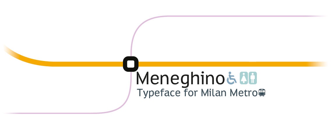
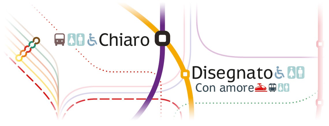
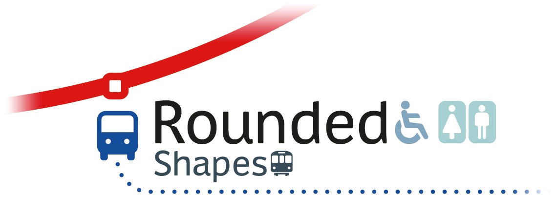
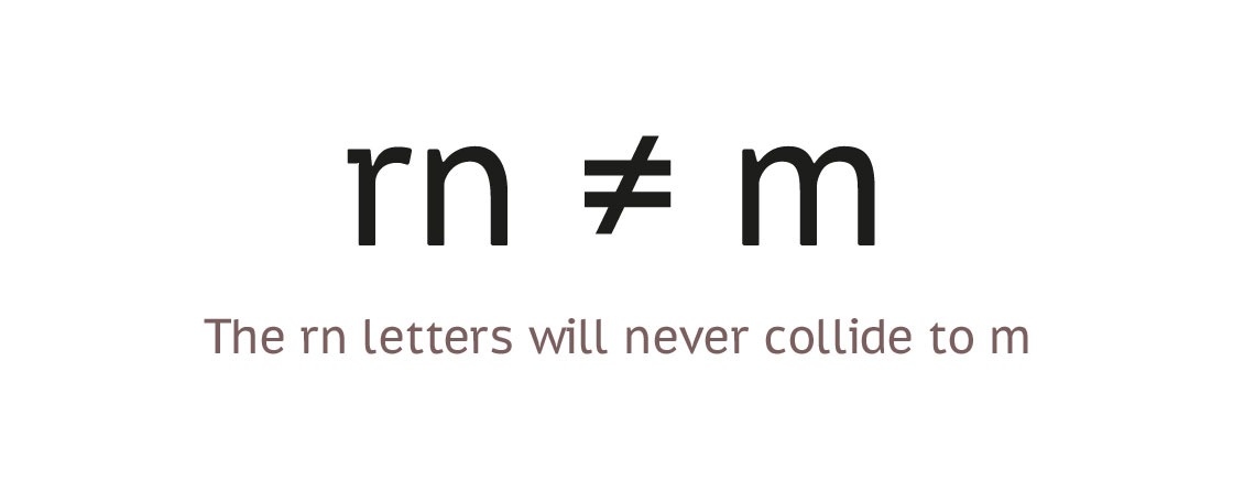
| Описание | Meneghino is created specially for Milan Metro Map and other wayfinding purposes. It is an adapted and slighly more condensed version of PT Sans Caption. Reworked are the Q, the R's leg is a tribute to PRADA, the latin K and k use a new connection. Ligature-encoded pictograms are added to the font. PT Sans is a type family of universal use. It consists of 8 styles: regular and bold weights with corresponding italics form a standard computer font family; two narrow styles (regular and bold) are intended for documents that require tight set; two caption styles (regular and bold) are for texts of small point sizes. The design combines traditional conservative appearance with modern trends of humanistic sans serif and characterized by enhanced legibility. These features beside conventional use in business applications and printed stuff made the fonts quite useable for direction and guide signs, schemes, screens of information kiosks and other objects of urban visual communications. The fonts next to standard Latin and Cyrillic character sets contain signs of title languages of the national republics of Russian Federation and support the most of the languages of neighboring countries. The fonts were developed and released by ParaType in 2009 with financial support from Federal Agency of Print and Mass Communications of Russian Federation. Design - Alexandra Korolkova with assistance of Olga Umpeleva and supervision of Vladimir Yefimov. |
Комментарии