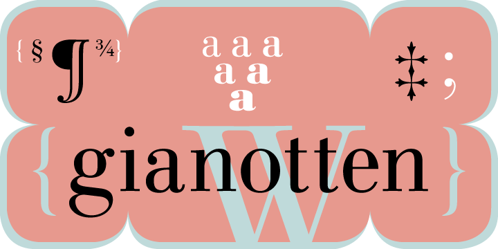
Linotype Gianotten Gianotten Italic шрифт
Лицензия: Платный
Автор: Linotype
Языки:
Латиница
Информация о шрифте
Мы собрали всю самую важную информацию о шрифте Linotype Gianotten Gianotten Italic. Ниже приведена таблица о версии файла шрифта, лицензии, копирайта, имя дизайнера и вендора-продавца. Информация взята с "TTF" файла шрифта.
| Имя семейства шрифтов | Linotype Gianotten Italic |
| Имя шрифта | Linotype Gianotten Italic |
| Имя начертания | Italic |
| Идентификатор шрифта | com.myfonts.easy.linotype.gianotten.linotype-gianotten-italic.wfkit2.version.3HFf |
| Версия шрифта | 1.03 |
| Торговая марка | Linotype Gianotten is a trademark of Heidelberger Druckmaschinen AG which may be registered in certain jurisdictions, exclusively licensed through Linotype GmbH. |
| Дизайнер | Antonio Pace |
| Ссылка дизайнера | http://www.linotype.com/fontdesigners |
| Ссылка на продавца(вендора) | http://www.linotype.com |
| Производитель | Linotype GmbH |
| Копирайт | Copyright © 2000 - 2005 Linotype GmbH, www.linotype.com. All rights reserved. This font software may not be reproduced, modified, disclosed or transferred without the express written approval of Linotype GmbH. Linotype Gianotten is a trademark of Heidelberger Druckmaschinen AG which may be registered in certain jurisdictions, exclusively licensed through Linotype GmbH. This typeface is original artwork of Antonio Pace. The design may be protected in certain jurisdictions. |
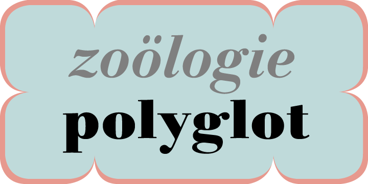
| Описание | It took the Italian designer Antonio Pace more than five years to create Linotype Gianotten, a successful new interpretation of the classic Bodoni types. To re-draw the 200-year-old characters for the world of modern digital technology, Pace studied Giambattista Bodoni's original punches at the Bodoni Museum in Parma. He felt that previous Bodoni interpretations were not well suited for body texts, so he focused his study of Bodoni's "Manuale Typografico" on the types made specifically for text sizes. Consequently, his Bodoni has strong hairlines, rounded transitions and shorter, fluted serifs - elements that help to achieve readability by providing an overall tranquil effect. This contemporary, highly readable family is an excellent choice for text settings in books, newspapers, and magazines. Incidentally, the name Gianotten has nothing to do with Bodoni, but was chosen by Antonio Pace and Linotype to honor Dutch typographer, Henk W. J. Gianotten. |
Похожие шрифты
- Linotype Gianotten Pro Light
- Linotype Gianotten Pro Light Italic
- Linotype Gianotten Pro Regular
- Linotype Gianotten Pro Italic
- Linotype Gianotten Pro Medium
- Linotype Gianotten Pro Medium Italic
- Linotype Gianotten Pro Bold
- Linotype Gianotten Pro Bold Italic
- Linotype Gianotten Pro Black
- Linotype Gianotten Pro Heavy
- Linotype Gianotten Pro Heavy Italic
- Linotype Gianotten Gianotten Light
- Linotype Gianotten Gianotten Light Italic
- Linotype Gianotten Gianotten Regular
- Linotype Gianotten Gianotten Medium
- Linotype Gianotten Gianotten Medium Italic
- Linotype Gianotten Gianotten Bold
- Linotype Gianotten Gianotten Bold Italic
- Linotype Gianotten Gianotten Black
- Linotype Gianotten Gianotten Heavy
- Linotype Gianotten Gianotten Heavy Italic
- Linotype Gianotten Gianotten SC Light
Комментарии