Linotype Didot Pro Roman шрифт
Лицензия: Платный
Автор: Linotype
Языки:
Латиница

Информация о шрифте
Мы собрали всю самую важную информацию о шрифте Linotype Didot Pro Roman. Ниже приведена таблица о версии файла шрифта, лицензии, копирайта, имя дизайнера и вендора-продавца. Информация взята с "TTF" файла шрифта.
| Имя семейства шрифтов | Linotype Didot Pro Roman |
| Имя шрифта | Linotype Didot Pro Roman |
| Имя начертания | Roman |
| Идентификатор шрифта | com.myfonts.easy.linotype.didot.pro-roman.wfkit2.version.52wJ |
| Версия шрифта | 1.000 Build 1000 |
| Торговая марка | Linotype Didot is a trademark of Monotype GmbH and may be registered in certain jurisdictions. |
| Дизайнер | Adrian Frutiger; Linotype Design Studio |
| Ссылка дизайнера | http://www.monotype.com |
| Ссылка на продавца(вендора) | http://www.monotype.com |
| Производитель | Monotype GmbH |
| Копирайт | Copyright © 2014 Monotype GmbH. All rights reserved. |
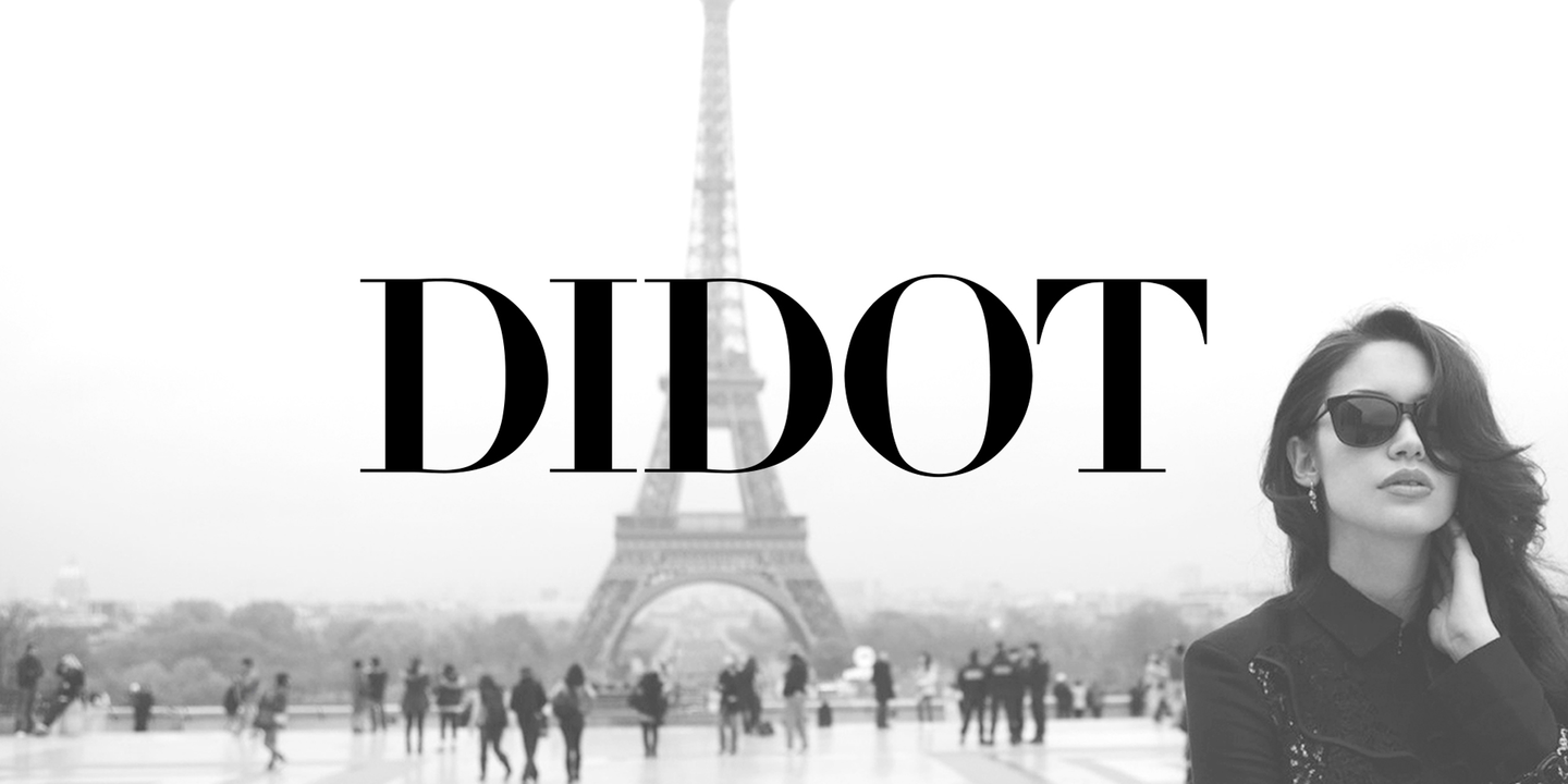
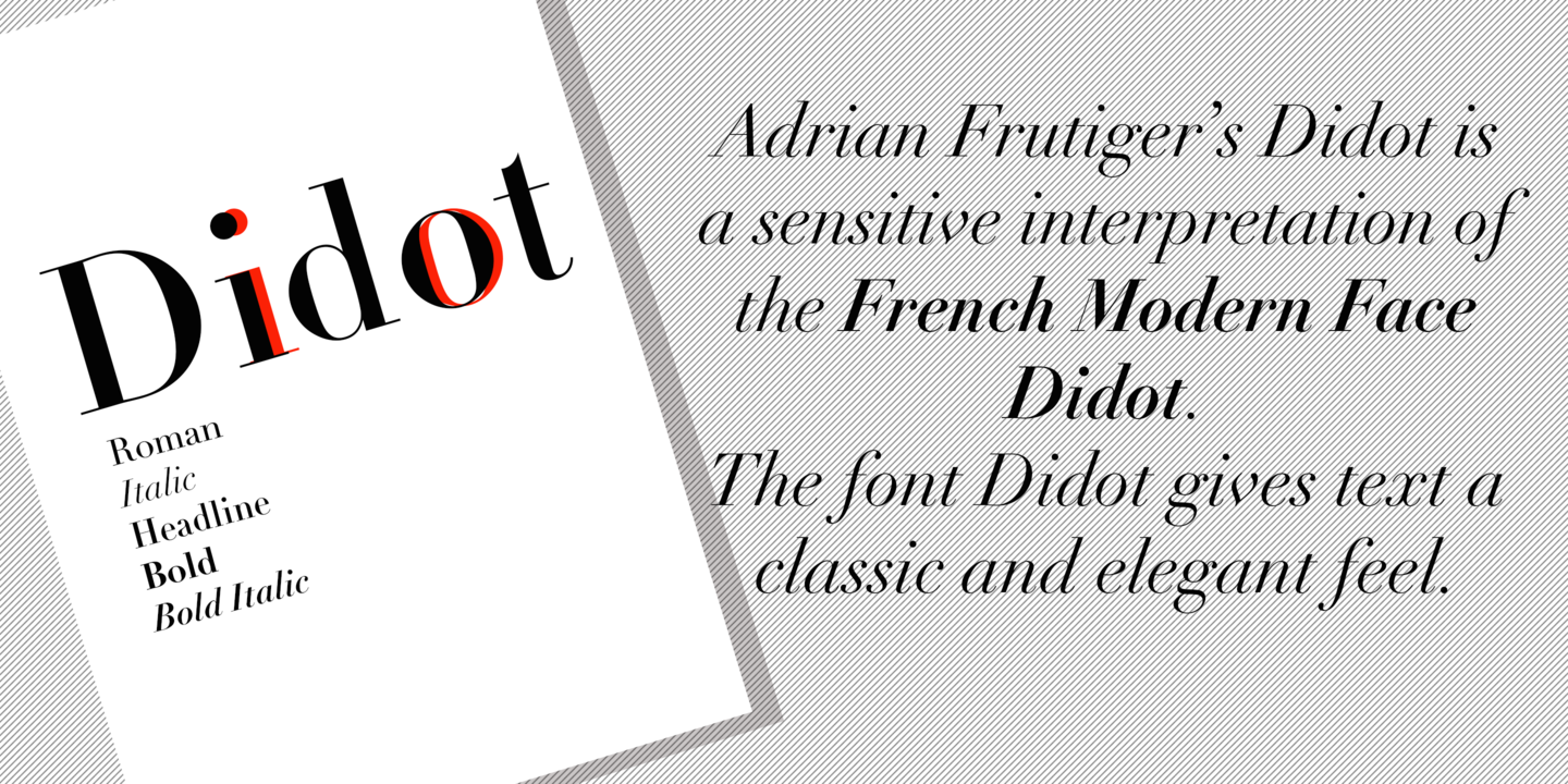
| Описание | For about 100 years in the eighteenth and nineteenth centuries, several members of the Didot family were active in Paris as designers. They were also printers, publishers, typefounders, inventors, writers and intellectuals. Around 1800, the Didot family owned the most important print shop and font foundry in France. Pierre Didot published books and prints set in typefaces designed and punchcut by his brother, Firmin Didot. The statuesque, clear forms of the Didot alphabets are representative of the time, and are quite similar to those designed by Giambattista around the same time in Italy. These types are in the style known as ""modern"" - meaning they are characterized by extreme vertical stress and fine hairlines contrasted by bold main strokes. Linotype Didot was drawn by Adrian Frutiger in 1991, and is based on the fonts cut by Firmin Didot between 1799 and 1811. Frutiger also studied the Didot types in a book printed by the Didots in 1818, ""La Henriade"" by Voltaire.Linotype Didot is the right choice for elegant book and magazine designs, as well as advertising with a classic touch. |

Комментарии