Frutiger Pro Pro Roman шрифт
Лицензия: Платный
Автор: Linotype
Языки:
Латиница


Информация о шрифте
Мы собрали всю самую важную информацию о шрифте Frutiger Pro Pro Roman. Ниже приведена таблица о версии файла шрифта, лицензии, копирайта, имя дизайнера и вендора-продавца. Информация взята с "TTF" файла шрифта.
| Имя семейства шрифтов | Frutiger Pro 55 Roman |
| Имя шрифта | Frutiger Pro 55 Roman |
| Имя начертания | 55 Roman |
| Идентификатор шрифта | com.myfonts.easy.linotype.frutiger.pro-55-roman.wfkit2.version.53Gk |
| Версия шрифта | 1.02 |
| Торговая марка | Frutiger is a trademark of Monotype Imaging Inc. registered in the U.S. Patent and Trademark Office and may be registered in certain other jurisdictions. |
| Дизайнер | Adrian Frutiger |
| Ссылка дизайнера | http://www.monotype.com |
| Ссылка на продавца(вендора) | http://www.monotype.com |
| Производитель | Monotype Imaging Inc. |
| Копирайт | Copyright © 2014 - 2016 Monotype Imaging Inc. All rights reserved. |
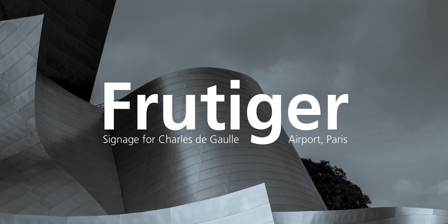
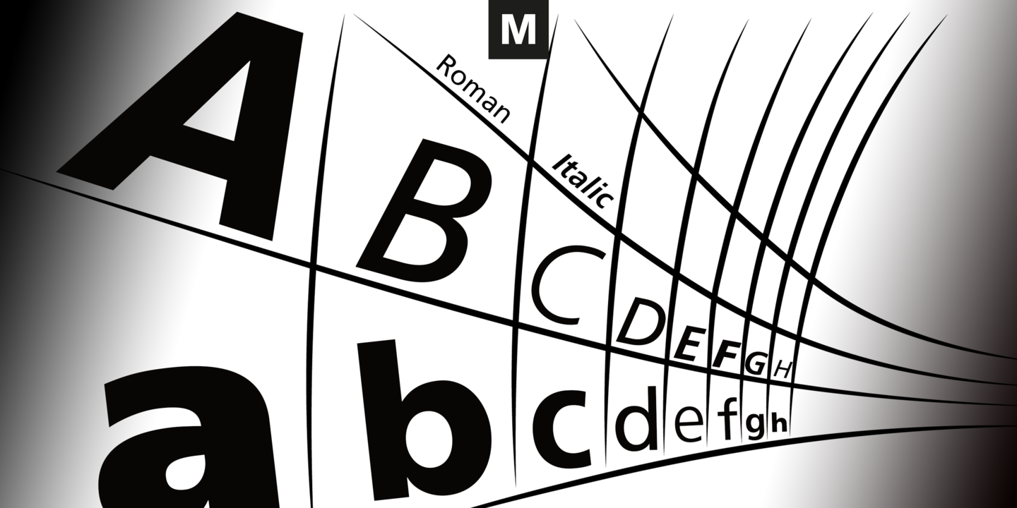
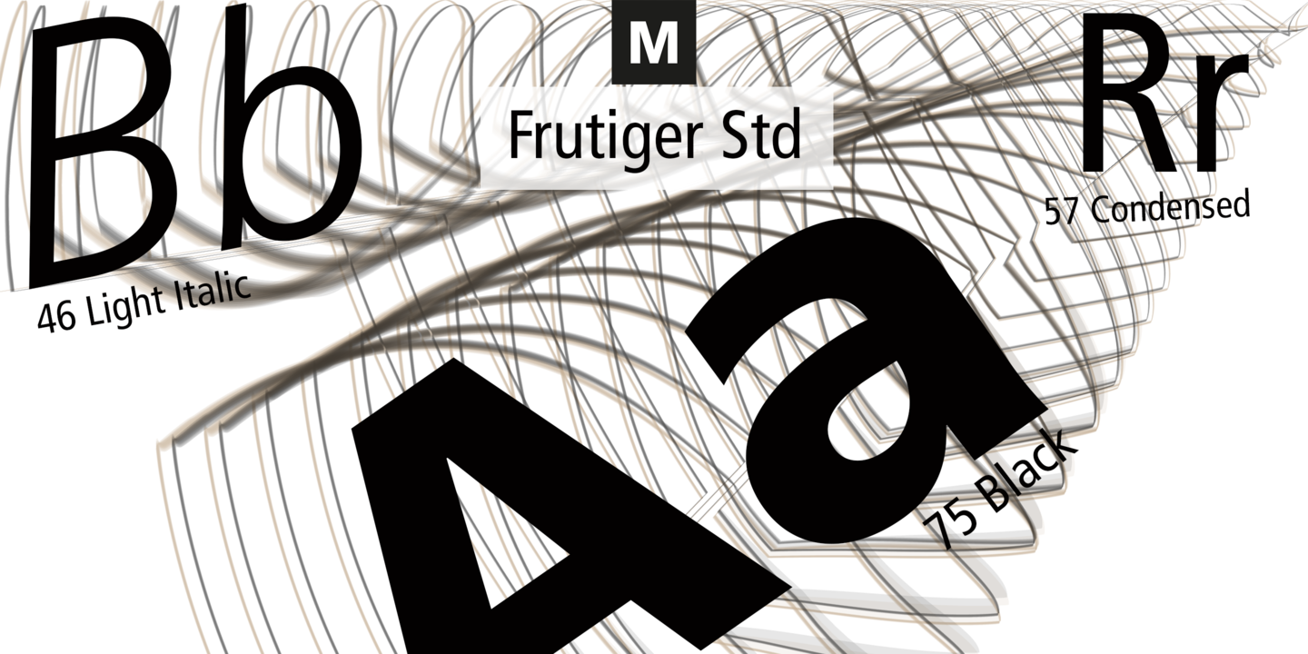
| Описание | In 1968, Adrian Frutiger was commissioned to develop a sign and directional system for the new Charles de Gaulle Airport in Paris. Though everyone thought he would want to use his successful Univers font family, Frutiger decided instead to make a new sans serif typeface that would be suitable for the specific legibility requirements of airport signage: easy recognition from the distances and angles of driving and walking. The resulting font was in accord with the modern architecture of the airport.In 1976, he expanded and completed the family for D. Stempel AG in conjunction with Linotype, and it was named Frutiger. The Frutiger family is neither strictly geometric nor humanistic in construction; its forms are designed so that each individual character is quickly and easily recognized. Such distinctness makes it good for signage and display work. Although it was originally intended for the large scale of an airport, the full family has a warmth and subtlety that have, in recent years, made it popular for the smaller scale of body text in magazines and booklets. |
Похожие шрифты
- Frutiger Pro Com Light Italic
- Frutiger Pro Com Italic
- Frutiger Pro Com Bold
- Frutiger Pro Com Bold Italic
- Frutiger Pro Com Black
- Frutiger Pro Com Black Italic
- Frutiger Pro Pro Light
- Frutiger Pro Pro Light Italic
- Frutiger Pro Pro Italic
- Frutiger Pro Pro Bold
- Frutiger Pro Pro Bold Italic
- Frutiger Pro Pro Black
- Frutiger Pro Pro Black Italic
- Frutiger Pro Pro Ultra Black
- Frutiger Pro Std Light
- Frutiger Pro Std Roman
- Frutiger Pro Std Ultra Black


Комментарии